Pages

Jun 26, 2015

3D Printed Google Cardboard keychain

There are so many useful things you can do with a 3D Printer - yet I keep finding myself wanting to make useless but creative 3D Product logos... I've done Google Sheets, Docs, Slides, Forms, Classroom, Forms, Google Drive, even Gmail. I've even posted the models at that link so people can print these for themselves.

This week, inspired by our recent announcement of Expeditions, I decided on a whim to do a miniature rendering of Google Cardboard.

I actually started this 3D Model as a possible working Cardboard unit, but decided to first try it in miniature to make sure the relative dimensions were close to accurate. Once I shrunk it down, I couldn't help but add a keychain hole and make it just a trinket to give to friends and others who work on the Cardboard team. It's tiny and super cute.

Keep an eye out for a working model soon(ish). I'm sure I'll get to that eventually, and it's much more of a challenge than the keychain trinket version. But if you see me this week at the ISTE Education Conference, I can show you the keychain version in person.

Jun 22, 2015

Computer on the Wall - a Middle School Maker project

I participate as a parent in our middle school Tech Club - the TechDetectives. The 8th graders in the club came up with this great end of year project idea - they wanted to take apart one of the lab computers and re-mount all the parts on the wall so that future students could easily see all the parts of this working computer. It was something they saw done on YouTube.
I've been calling it the "CoW" (Computer On the Wall).


I loved this idea - and quickly volunteered to help out after school - knowing we didn't have enough time in tech club before the end of their graduating year to finish it. As I described in a few posts previously, this project also turned into a great opportunity for some #3DPrinting solutions.

The Take-Apart


This was how it all started - taking the computer apart. We chose our victim (desktop PC), with the guidance of the group's teacher leader, from the 20 or so computers in the Tech classroom. We decided that we'd almost certainly get approval for this, especially since the school recently went 1:1 with Chromebooks, so we just dug right in. Pretty much anyone has fun taking things apart - so the students immediately started unscrewing, unclipping and disconnecting wires. They took pictures as we progressed in case we (or someone else) decided to cancel this project - so we could figure out how to put the computer back together again.

We created a hand-drawn map of the wiring so that we could re-connect parts in the right place on the mother board. There were hardly any challenges at this step - as desktop computers in large cases are pretty much made for upgrading - which means removing and replacing parts.

The Board Design


We planned on hanging the parts on the wall on a board - so it was important to figure out how much space we needed so we could acquire a board of the right dimensions to hold the parts. We talked a bunch as a team about different challenges - like how and where to run the wires, where to put the switches and plugs that were attached to the original computer case, and more. We also brainstormed a bit on added features we might want to add - like cool lighting or signs. In the end we stuck mostly to basics - except for the Big Red Button, which I'll explain below and was highlighted in a separate post.

We laid all the parts on the board which is about 14" x 28". Once we were comfortable with the layout, we started looking for ways to secure all these parts. The Motherboard - the centerpiece of the computer - looked simple. It has holes for mounting with screws. But all the other large parts - Hard Drive, Power Supply, CD Drive - had no obvious mounting method. We would need straps or strong glue or....or... 3D Printed Brackets! Oh, isn't that always my motive... See the next section for more.

While we planned to have some cool lighting on the board, in the end we really just ran out of time and settled for placing the existing LED on/off lights inside the Big Red Button box. It looks cool, but as of this writing still has a slight short circuit which needs to be fixed before hanging the project on the wall.

3D Printed Parts


There were a few things that we decided 3D Printed was truly a great option. I have previously posted about all of these - so  I'll point to those posts here and keep it short.

1 - Brackets for mounting - this allowed us to make custom fit brackets for each part.

2 - Speaker Box - without the computer case, the speaker had no home. It was like a turtle without a shell, until we created the perfect home for it.

3 - On/Off Switch - aka The Big Red Button - we made something seemingly boring, the focal point of the whole project. This was complex, but achievable.

The Result


This was a great project, with lots of hands-on mechanical interactions, some electrical connections, a bunch of testing of the equipment after mounting and re-wiring and even some painting (the board ;). The team was quite proud and presented the CoW (Computer On the Wall) to the school as their tech club legacy.

We're expecting to have it hung in the computer lab over the summer, clearly marked with "Class of 2015" and perhaps encouraging a tradition of each class taking apart one more computer each year and leaving their mark.

Jun 20, 2015

A 3DPrinted Speaker Box

When we decided in our school tech club to pull all the components out of a desktop computer and mount them on the wall (post on that coming soon), we didn't really expect this to turn into a 3D Printing project. But without the computer case, turns out there are lots of parts which need a home - and a few custom things where 3D Printing came in handy.

The Problem

Besides the Power Button (which resulted in the Big Red Button) and the custom brackets to hold all the main components, it turned out we also had an orphan speaker which needed a home. Sure, we could have just hot-glued the speaker to the board - but #3DPrinting a custom solution seemed like much more fun. We decided to craft a 3D model of a small box to hold the little speaker.

The Model

The design is quite simple, and the main challenge was to line up the screw holes with those already on the speaker component itself. 
Once we got that done on the bottom part of the case, we replicated it to make the top and cut holes in the top to let the speaker sound come through. We also added a couple of mounting parts for screws modeled after those we used on the Big Red Button.

The Result


We're quite happy with this small part of our larger project. The slots which let the sound escape are little less clean looking than we had hoped, so next time (yeah, right, I'm sure we'll do this again) we'll likely make those a bit wider and do more cleanup on them. The screw holes took one iteration to get aligned right, but once they were aligned, they worked really well. The slot on the side to allow the wires to enter the box was a good plan and don't detract from the aesthetic of the box at all. The mounting brackets for the screws also worked well.


Jun 18, 2015

Custom Brackets - 3D printing is perfect for School Maker project

As part of our middle school tech club's "PC on the wall" project (which I'll describe in full in a future post very soon), we found a few opportunities for using 3D Printed custom parts. I've already posted about the on-off switch - which we aptly called the Big Red Button. This time, I'll share how we created custom brackets to hold most of the PC components to the wall board.

The Challenge

Once we had extracted all the main components from the PC case, it was obvious we needed some new method of holding these things against a board that would hang on the wall. We thought about creating straps out of canvas or even duct tape, or perhaps making custom wood brackets. But it struck us that 3D Printing might actually be the most efficient and flexible solution to this problem.


The Solution


Each component has different dimensions and weight. Besides holding the component to the wall, we also hoped to raise each component away from the wall board by just a little bit to help with cooling and perhaps leave room for some lighting for decoration. The brackets could follow a simple consistent design and just be measured to fit each component. We used our caliper to measure the height of each component away from the wall and that was pretty much all we needed to know. The width and length of the components didn't much impact the design, except in the case of the power supply - explained below.

The Design

Each bracket has a spacer for under the component and a screw hole to hold the bracket firmly in place. Then attached is a simple "L" shaped part which extends away from the wall board and over the top of the component by an inch or so.

The power supply needed a slightly different approach given it's weight and height away from the wall board. For that we designed something that looked more like a strap - a single part that started on one side, went over the top to extend the width, and ended on the other side - with screw holes on both sides. This worked really well.


The only other customization required was one bracket for the CD drive, which had a slightly uneven top height - we designed one of the brackets to specially fit into that spot. again, the customization worked like a charm.

Here's a quick view of 2 sizes of the simple design.


Here's a partial picture of the finished mounted components.


Jun 14, 2015

Gmail catches up to Google Docs - with a 3D Printed Logo

Showing off my 3D Printed Logos of Google Docs, Drive, Sheets, Slides, Forms and Classroom at work gets other Product Managers in an envious state.

"Where's the Gmail logo?"

I heard that almost immediately, and at every subsequent showing, from the Gmail guy.
Well - as I explain to the Gmail guy, the Gmail logo, as we all know, is two-color, so quite challenging for a single extruder printer.

"You figured that out for the Drive logo - do it for Gmail!".

OK - done.

The Design


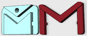
The Gmail "M" is red and the "envelope" is white. I created small protrusions on the "legs" of the M which fit into small receiving holes in the sides of the envelope. I also created a base in the envelope so that the protrusions on the M could be printed flat on the print bed and not show from the back of the logo when put together. This also makes it so that the M could not be seen from the back - which may have looked good, but definitely not necessary.

The M is also made so that the top part of the M is higher - a larger Z depth - to make it look like the edge of the envelope flap... exactly as done on the 2D graphic of the Gmail logo. Otherwise, it's a really simple model.

The Results


The first pair (envelope and M) I printed were not a perfect fit by any means - tool lots of cleanup of edges on the M to fit it into the receiving space on the Envelope - but I got it to fit and made some adjustments in the model to give some more room for error (more clearance) without making the fit too loose. The red filament I used - from Ultimachines - also tended to be a bit over extruded and oozy - so there was more of a brim than expected. I also think the humidity had an effect on the day I printed this particular model.

The current version of the model prints well and is easy to put together. Looks great as a useless keychain ornament... You're welcome, GMail guy.

The Model


If you want to try printing this yourself, the STL files can be found on the Google Product Logos page. Warning: on my printer, the bottom layer is almost always a bit squashed and creates a slight brim which needs to be shaved down with a knife a bit to fit well into the white part.

How to Make a 3D Printed Hinge

Modeling in 3D is much easier than it used to be, thanks to apps like Autodesk 123D Design and many others. But depending on the object you are trying to model, it might be tough no matter how easy the app is. In some cases, the modeling and design is just challenging.

Take for example box with swinging door. Sure, you could print a simple box, a simple door and then screw or glue a metal hinge to connect the two - but wouldn't it be cool to #3DPrint the hinge too?!

I came up with a hinge design that I doubt is that unique, but I started from scratch just for the challenge. Once it was printing well, I put together these instructions on how to 3D Model it so that others can see how it might be done. There are likely a hundred other ways to do it, but here's one way. If you can't see the presentation below, Click Here to get to the published version in Google Slides

Jun 8, 2015

In an emergency, 3D Print a Big Red Button (then press it)

Working on a project with the middle school tech club - to take apart a computer and mount the working parts on the wall (more on this in a later post) - we decided we needed a Big Red Button to turn the computer on and off. The tiny switch that was on the front of the PC case was just not going to give the right appeal when hung on the wall with the rest of the guts of the computer.

I'm always looking for opportunities to design, model and print things on my 3D Printer - so I took this challenge and pursued the Big Red Button.

The Design

Inside the button, we just needed to have the original switch which the button would activate - but the design of the button could be pretty much anything we wanted. We decided on a simple Big Red Button in a yellow box.

I ended up with three components to this design so that it would print easily on the 3D Printer. This is often the main challenge with #3DPrinting - modeling things that will actually print reliably - so multi-part designs are often the way to go. In this case, the requirement for moving parts also made it likely that multiple parts would be the answer.

1 - The Button Box - a big yellow, hollow box with a hole at the top to hold the actual Red Button.

2 - The Button - a big Red semi-circle which would stick out the top of the button box and move freely up and down.

3 - The Button Base - a flat base around which the button box would sit, containing a mount for the spring, a mount for the switch and some parts which would keep the button in the position we desired.

Building it to work

We also obviously need the non 3D Printed parts - a big spring and the electronic switch. The switch was already present in the electronics of the PC, so we designed the button base to have a stand for that switch which held it firm against the big red button - just the right height to activate with a simple button press. We also decided to hold one side of the button more firmly in place (those two tall towers on the base) so that the button wouldn't wobble too much.

The button works quite well.
At the last minute, we also decided to mount an LED inside the box, so we did that after printing by drilling a tiny hole in the side of the box.

I could see printing lots of these.... for... well... something!
Got ideas? Put them in the comments!

Jun 4, 2015

Battery Box keeps those pesky button batteries

I've got lots of random electronic parts laying around in drawers and organizers, but by far the most annoying are those button batteries. I'm always worried that having them loose will cause them to make contact with other conductive parts or each other, shorting them or draining them.
NOTE: If you're interested in reading about a printing discovery I made during this project, read my other post called "Speed Up 3D Printing" - which could have been titled: "How I made my 3D Printing 62% Faster".

The Need

I haven't seen a good mini-organizer for storing these, so I figured I'd "invent" one (yeah - I use that term very loosely - as it's not exactly an invention, more like a custom thingy). The Button Battery Box (tm, patent pending, not) will store bunches of button batteries safely and efficiently. I'm of course starting with a size that works well for the batteries I have laying around - the LR44 - and then I'll move on to the CR2032.

The 3D Model Solution

This was a pretty easy model to create. The only real challenge which took some experimentation (and could use more) was the box cover, which I wanted to attach securely. The method I used was not the optimal one. but that's typical to discover a better way of doing something after you do it not so well.

The method I used was to create the outer container box first, then to use slats to break up the main compartment into equally sized tiny compartments for one battery each. This was tedious to get the measurements right. The only benefit to this method was that it made it easy to have the outer walls of the box have a different (higher) height than the inner walls.

The method I SHOULD have used (which I have used in other applications) is to create one single battery tiny compartment and then replicate it and put them all together to form a larger box of individual spaces. While that would have required me to build up the side walls separately, it would have been easier than setting up the slats in perfect separation from each other (although 123D does have a simple method for that too).


Next step will be to create a similar box for other parts - then to make a holder for all these boxes that looks like a miniature dresser :)


Jun 3, 2015

Speed up 3DPrinting - Shell Thickness "Trick"

The multi-compartment box
as seen in Autodesk 123D
In creating a fairly simple 3D Model of a multi-compartment box, I discovered a super simple way to decrease my print time - in this specific case by 62%! This simple model that was taking 68 minutes to print took just 26 minutes, thanks to changing one not-so obvious setting in a way which really is just tricking the software into doing what I expected in the first place.
[update: if you want more info on this particular model - a Button Battery Box - see my newer post on that]

Background

The "SHELL THICKNESS" setting in slicing software is used to define how many side-by-side solid lines of plastic will be used to line the walls of your model. With thin wall models - like a small box - the wall of the model, the Shell,  defines how strong the box will be. So it is quite important. That setting also MUST be a multiplier of your printer's nozzle width. (according to in-app tips, help content and lore, which I now know is misleading).

The expectation:

the box in CURA Layer view -
notice the hollow walls.
If I create a 3D model with wall thickness that is equal to the width of my 3D Printer's nozzle - and set the "shell thickness" to that number - it should print with one "run" (one strand of extruded plastic, one motion in the path of my object shape). In my case, my nozzle width is 0.35mm - so a shape with a thickness of 0.35mm should only take one straight run - and that should be efficient. Now CURA, like most good slicing apps, let's me define my "SHELL THICKNESS" - and suggests (but doesn't force) that I make this a multiplier of my nozzle width - since my printer can't very well constrain the width to less than that.

The same should be true with thicker wall, which of course will be multipliers of my nozzle width. If I have a part which is exactly two times (2X) my nozzle width, it should take two "runs". Same with a 3X setting - as long as I make my Shell Thickness the correct value. So, I thought I would be smart about creating this model - and make my walls 1.05mm in width to get both efficient printing and strong walls. Three runs with my 0.35mm nozzle, and no inefficient "fill" (which has a tendency to be done with tiny back-n-forth x/y strokes) - right?
Wrong.

The Discovery

The printed box with cover
CURA apparently is not happy when the "Shell Thickness" setting is precisely the same value as the actual model thickness. It seems to interpret that as something that will require fill. But, CURA can be influenced to print more efficiently with slight changes to the "Shell Thickness" setting to break this rule. I hesitate to call this a CURA bug - but I do think this is a simple computer math issue that comes up often in things as simple as spreadsheets, which has to do with imperfect rounding (or unexpected at least).

CURA was doing something strange with my box model - with walls equal to 3X my nozzle width. It would either not make solid walls - or it would use my "FILL DENSITY" setting to inefficiently fill the tiny space between the outer and inner walls of the box. No matter what I did, the model would either not print solid walls (fill density of zero) or would take 68 minutes to finish due to the crazy movements of my print head to fill a space which hardly existed.

The Experiment

I created a simpler square box - just one compartment - 20mm square - with walls which were exactly the thickness of my nozzle width - 0.35mm.
The 20mm simple box showed a 33% estimated improvement in print time
I loaded that into CURA and set "Shell Thickness" to 0.35mm. What I got was NO WALLS (and an estimated print time of 1 minute, since it would have only printed the bottom without walls). CURA apparently did not think it could fit one run of 0.35mm of plastic out of my nozzle into a 0.35mm wall in my model! I experimented by changing the "Shell Thickness" to 0.34mm - and Voila! The walls appeared again.

I tried the same box experiment with a 1.05mm wall width and Shell Thickness setting, and CURA would happily print the walls, but it would not fill the middle space - unless I used fill density (any value actually). But again, when I changed the Shell Thickness setting down by one-hundredth of a millimeter (0.01mm) to 1.04mm, Viola - it printed the walls with 3 straight-line runs, as I wanted in the first place. As you can see from the two screen shots, even this simple model had a reduction in estimated print time of 33% (from 15 minutes to 10 minutes).

The Solution

I then took my existing 1.05mm wall, multi-compartment box and changed that setting to 1.04mm "Shell Thickness" (leaving "Fill Density" at ZERO) - and BAM! The walls showed as solid - 3 runs of plastic. MOST IMPORTANTLY, with this one tiny change - hundredth of a millimeter on one parameter - the time to print on my box model went from 68 minutes to 26 minutes - a 62% reduction in time!

Summary Data: 

Walls of box:  1.05mm
Shell Thickness setting:  1.05mm
ACTUAL Print time:  68 minutes

Walls of box:  1.05mm
Shell Thickness setting:  1.04mm
ACTUAL Print time:  26 minutes

Jun 2, 2015

Printer Review Video: M3D Micro 3D Printer

Here's a video version of the M3D 3D Printer review that I previously posted here on the blog. Thought it might be easier to get the points across on video.

If you want to buy this printer, use this link.
Disclaimer, it may pay back a commission to me, but I will donate 100% of any earnings to worthy educational causes.