Making Text Objects
The 3D Modeling software/app you're using will either help you or hinder you from making great text objects. Most 3D modeling Apps have some sort of text object which allows you to create what you need and then change it's font, size, weight and style to get the look you want. There are so many 3D modeling apps available today, but here are how a few of the ones I know stack up in terms of their text rending.
Autodesk 123D Design is my current favorite modeling app. It has a text object which allows you to select the font from a long list of about 174 fonts (!), but not all of these actually render (probably due to fonts installed locally and typical licensing issues with traditional fonts). Even if you do find a font you think is cool, remember that they're not all appropriate for extruding into 3D objects. In 123D Design, you first generate a shape and then you extrude that text into actual objects. I found some issues in 123D Design with the "Bold" style of several fonts - it simply will not extrude certain characters into an object - specifically the "@" symbol gave me issues with a font like Futura (bold). But notice that most of my favorite fonts for 3D Modeling are bold - this just helps avoid letter parts which are too thin for good printing. Note that 123D Design also has a great iPad app, but there doesn't seem to be any text support as of this writing.
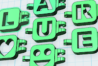
TinkerCad is a great option for kids and beginners and only requires a modern web browser like Google Chrome. It has a whole category of 3D capital letter objects, popular symbols and numeric digit objects ready to go, which you add to your model one character at a time. But it also has a more generic "Text" object which allows entry of any text, selection of font (from a list of only 6 for now), weight and size. It's not a huge selection by any means, but definitely useful. Find the text option under the right panel object selector called "Shape Generators".
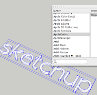
 Sketchup is another great, and arguably much more professional, 3D Modeling app - locally installed on Mac and Windows computers. It has around 200 fonts with many different weights to chose from. I don't use this product on a regular basis, but if you really want some professional features or hope to continually increase your 3D Modeling skills, give it a try.
3Dtin is another web-based modeling product used inside a browser. It has only 3 fonts to choose from, and they let you make letters in positive or negative form as soon as you create them.
Morphi is an iPad app which does have some text support, but you have to upgrade the free version for $2.99 to get the full alphabet. There's only one font - basically fully rendered upper and lower case letters - but if you're modeling on the iPad there are not as many options, and this is a great app (which also supports freeform drawing to create objects once you upgrade to the paid version).
Font Suggestions
Some fonts that I found work really well in many cases are the following:
(in Autodesk 123D Design - which is my go-to modeling product. You may find others in the other apps mentioned above or in your 3D Modeling app)
Arial (bold), Futura (bold), Gill Sans (bold),
Gurmukhi MN (bold), HeadLineA (bold), Impact,
Iowan Old Style (bold), Kannada MN (bold), PT Sans Caption (bold),
PT Sans Narrow (bold), Seravek (bold), Trebuchet MS (bold),
Verdana (bold).
Optimizing Your Text
 |
| Baskerville font - thin parts |
Things to consider when picking a font include the letter thickness and the complexity of the shape - and it helps to actually extrude the text into objects to look for potential problems. The two main problems that exist are letter segments which are too thin, and orphaned parts.
The example shown here is a font called Baskerville. It's a beautiful classic serif font, but you can see that the width of several parts are extremely thin, so at small sizes, the printing might be too fragile or just not print well at all. Only use fonts like this in bold or larger sizes. When printing in small sizes, I highly recommend avoiding serifs and other complex, thin parts to the letters - and even in big sizes, these details will increase the print time significantly.
The other problem shown uses the lower case "i" and "j" which both are dotted letters and therefore result in what I call "Letter Islands" - that is the dots themselves are not connected in any way to the letter. To use these letters, you can use some tactics I describe later in this post.
Positive or Negative
With designs which have text, you have basically two high level options in your designs. Positive text is just rendering the letters as objects themselves, or where the outer perimeter of the letters is raised out of another objects surface. Negative text is where the letters are pushed INTO another object - whether completely through, like a stencil, or just partially, like being carved or stamped into the other object.
 I used a negative design exclusively in one of my prior projects (Alpha-lets) which had one letter at a time stamped out of individual links (to make name bracelets). That worked really well, but was a lot of work to resolve and reconnect all the "orphaned parts" (letter islands) for every letter with a circular pattern - letter "O" being the most obvious, but a problem which exists in 7 of the capital letters in the english alphabet.
My Name Tag project used a positive design and employed a "foundation" to hold all the characters together as one part.
 To make a foundation, you simply create a long rectangle or other shape part which stretches to touch at least one part of every character in the design. I used a rectangle at the bottom of the letters in several cases, but you can see I also used the Twitter Bird in one of the designs to be the foundation for the letters. This can be an area of great creativity, where you can make the functional element of the foundation become a style element of the design itself.
When extruding your positive text, you might be tempted to make the letters higher than they ought to be. I would start not too high, and only use very high letters if the design simply looks amazing with that style. In most cases, the text becomes less legible, since you can't see the outline of the letter as well from the side.
Letter Islands
 |
| Connector holding the Letter Island in the middle of the @ symbol |
One important complication that arises much more with negative designs than positive is the "orphaned" bits - those parts which are no longer attached to anything to become part of the object. I call these "Letter Islands". In positive designs, the dots on the lower case "i" or "j" are the only letter islands. In negative designs, you get letter islands with every circular letter and others - the inside of the "A", "B", "D", "O", "P", "Q", and "R" all have this issue, and that's just the capital letters. Depending on the font you select, you might experience even more of these issues due to loops that are part of the style of the font (think of the script "L").
I used a couple of solutions for letter islands. First, I would create small connectors - bridges - and simply connect the bridges to the other parts of the letters in places which seemed natural. This gave the look of a stencil to the negative letters in my Alpha-lets project. Second, and much easier, I would simply create a base on which to place all the letter parts so that they rise out of a platform. That was a much simpler approach that even a beginner can do with practically no effort. This is a motivating first project for kids!
Summary
Use text! It makes your designs interesting, unique and personal. Kids in particular love to see their name or nickname turned into a real object they can wear on their backpack or keychain, and even adults really become more interested in how they might use 3D Printing when they see the impact of a custom logo or personalized product. The simplest way to get started is to choose a great font, like Impact, then simply mount all your letters on a solid background "foundation" to avoid the issues of letter islands - and then try something more complex.


nice article on fonts... Here's a way for some enterprising programmer to make $$$ - figure out some extra font 's for or tinkercad ! I am sure our community would pay a few bucks for a package.
ReplyDeleteGuess will have to make my own since there are none out there . . I to was looking for lower case letters to add to my pile of things
ReplyDeletehang on... there are PLENTY of lowercase letter on Tinkercad - you have to use the SHAPE GENERATORS on the right side menu... in there is a TEXT option!!
ReplyDeleteI'll have to so a video or blog post on this.