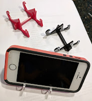
 What better first object to design than a custom phone stand?! I've never done that before (ahem).
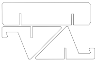
The design I had in my mind was quite simple, so I sketched a quick version of the idea on paper - it was just two identical, vertical parts which actually support the phone, and a perpendicular support which keeps the two stand parts aligned and stable.
Detailed Requirements Planning
What are my "Design Do's and Don'ts" for this product?
Here's the simple list I compiled for this phone stand product:
- Hold a phone easily and quickly without having to open, close, snap-in, pry or otherwise fit the phone into anything. I just want to drop it in and easily take it out.
- Hold a phone BOTH vertically (portrait) AND horizontally (landscape).
- Hold a phone at a comfortable video-viewing angle on the desk - mostly upright, not flat - less than 90 degrees from the desk, but more than 45.
- Hold any phone, regardless of size, including my big Pixel XL and my son's small iPhone.
- Don't obstruct any of the screen.
- Be easy and fast to cut on the Laser Cutter, using minimal materials. Cheap to make.
- Be simple, not fancy - since it's mostly hidden behind the phone.
- Easy to put together, and bonus if it comes apart to fit in your pocket.
Reflecting on the Design Process
 Even for a project this simple, you can see it's pretty easy to quickly come up with a whole lot of detailed requirements! That's actually what we do at work all day as product managers - mostly with software - but sometimes with hardware. I think it's good practice to be this detailed and diligent with #maker projects too, especially when it's teachers using these projects as lessons to achieve other learning objectives.
This allows for each requirement to explicitly be solved with math or art and design or other skills, depending on the project. Every one of these requirements can have it's own failures, learnings, solutions, inventions and insights attached to it - and this is where even a simple project becomes an engaging and inspiring learning adventure!
Cardboard Prototype
The cardboard version was actually strong enough to hold my phone firmly - maybe I should stop here and declare victory ;). I quickly realized this design could be used to hold other things too - like business cards - so even my cardboard prototypes are being put to good use as business card holders.
Getting to a Final Version
First, I wanted the three parts to stay firmly together so it didn't fall apart when picked up, but be able to come apart when needed (for pocket carrying). I experimented with notch designs which help the parts "click-in" and stay together, but are simple to pull apart. (Note: this was a revisit design adjustment once I had more experience with the Laser Cutter and acrylic material... not a beginner design.)
Second, I wanted it to feel firm and not flimsy - which wasn't true of this current design. The 3-part design felt like it could break easily - it was "racking" (a wood-working term where an object doesn't have the right opposing angles of support, making it prone to leaning or breakage at the joints). It was simple and it worked... but I wanted it to be better.


